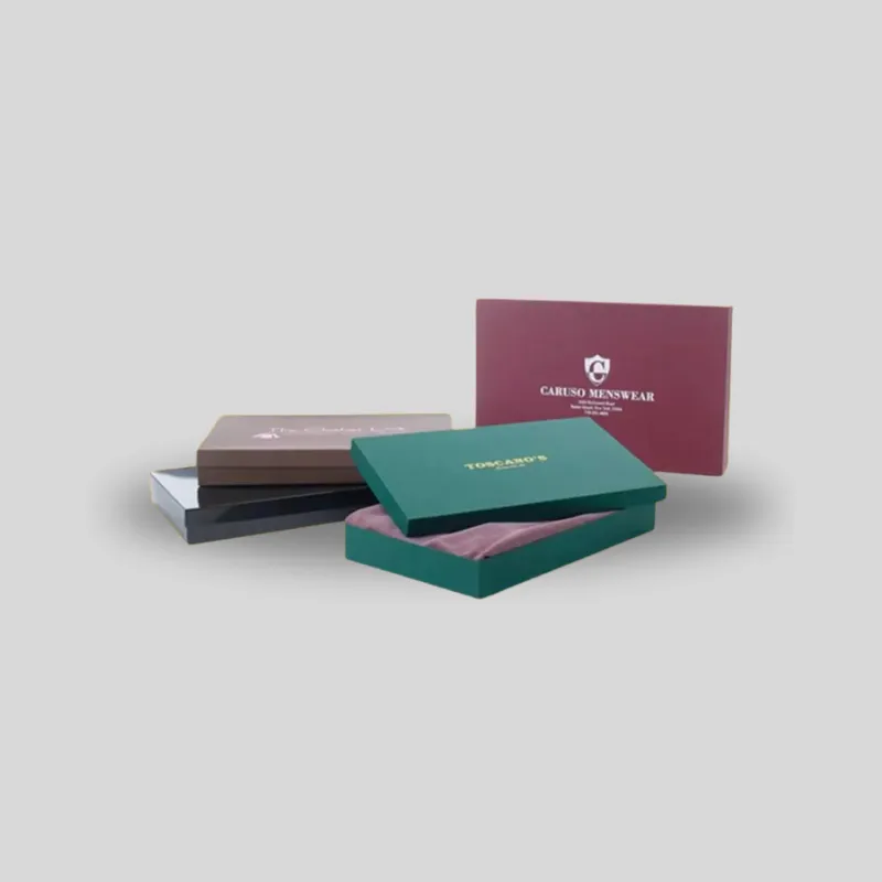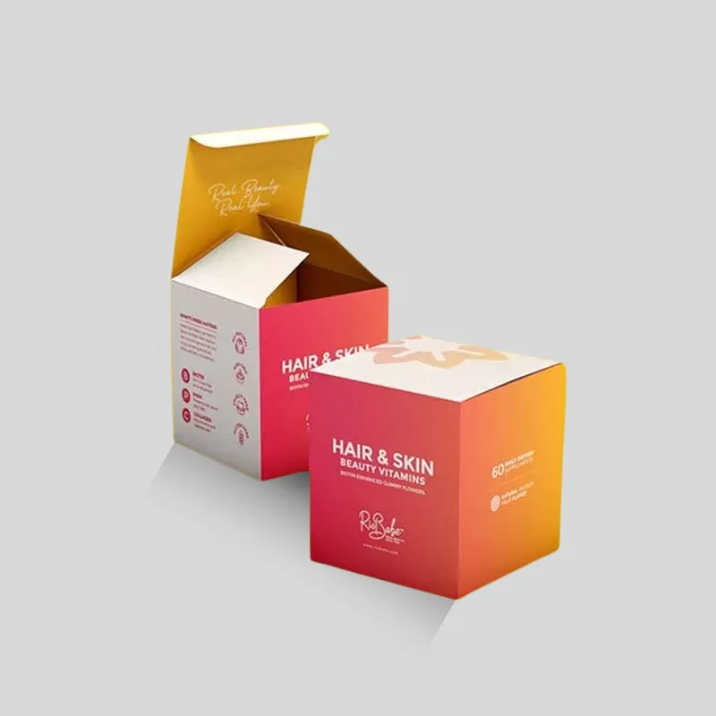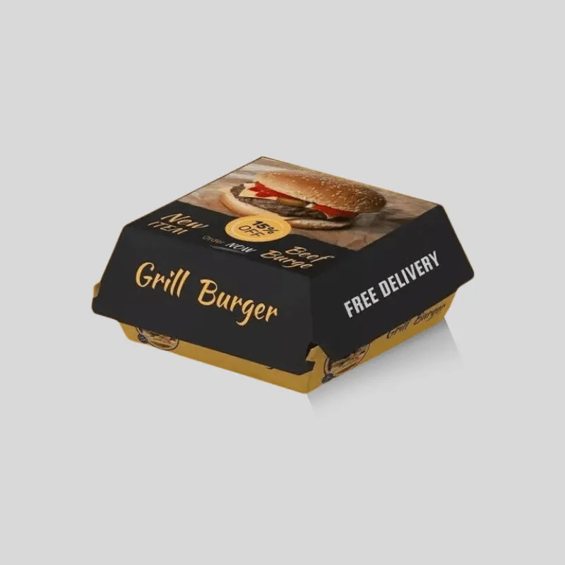
Choose CMYK for packaging when the design uses photographs, gradients, illustrations, or many colors. Consider Pantone spot colors when a solid logo or signature brand color needs tighter control across a production run. Some packages use both. The right choice also depends on the print method, quantity, substrate, finish, and acceptable color tolerance, so approve color on a physical sample made on comparable material rather than relying only on a monitor.
This guide explains CMYK vs Pantone for packaging from a buyer’s perspective. It will help you prepare artwork, ask useful proofing questions, and request a quote that compares the same specifications.
Quick comparison: CMYK vs Pantone for packaging
CMYK and Pantone solve different color problems. CMYK is a process system: cyan, magenta, yellow, and black are printed in patterns of small dots to build a broad range of colors. Pantone Matching System colors, often called PMS or spot colors, are identified by standardized references and are typically mixed as individual inks for a print job.
Use this quick decision guide:
- Photos and realistic product images: CMYK is usually the practical starting point.
- Gradients, shadows, and complex illustration: CMYK can reproduce many tones with four process inks.
- One or two solid brand colors: Pantone spot colors may offer more controlled targets.
- Metallic or fluorescent ink effects: ask whether an appropriate specialty spot ink is available.
- Several brand colors plus photography: a CMYK build, or CMYK plus selected spot colors, may be appropriate.
- Short digital runs: the equipment may reproduce the job through process colors rather than separate spot inks.
- Kraft or colored board: neither system should be approved from a white-screen preview alone.
“Pantone” does not automatically mean perfect, and “CMYK” does not automatically mean inaccurate. The printed result depends on ink formulation, press conditions, color management, board surface, coating, and the agreed proofing standard.
What CMYK process color does well
CMYK creates colors by combining percentages of four process inks. It is well suited to artwork that needs many hues without requiring a separate ink and plate for every visible color. Product photography, lifestyle imagery, gradients, illustrated patterns, and full-panel artwork are common reasons to use it.
Brisk’s Custom Folding Carton Boxes provide a useful context: a retail carton may need product photography, fine typography, multiple flavor colors, and required information on several panels. A process-color workflow can handle that visual variety efficiently when the selected printing method and board are suitable.
CMYK has limits. A bright RGB color displayed by light may sit outside the reproducible range, or gamut, of a particular CMYK press profile. Converting artwork from RGB can make some saturated blues, greens, oranges, or purples look less intense. A CMYK formula can also reproduce differently across printers, substrates, press profiles, and finishes.
For that reason, “use these four percentages everywhere” is not always a complete brand-color standard. Tell the packaging supplier what visual reference matters, which elements are color-critical, and what equipment or proof will be used for approval.
What Pantone spot color does well
A Pantone reference gives the designer, buyer, and printer a shared target for a named color. In conventional offset or flexographic work, a spot ink can be mixed and printed separately rather than simulated from four overlapping process inks. This makes spot color useful for a solid logo, a signature brand panel, fine one-color line art, or a controlled set of repeated colors.
Pantone can also specify colors that are difficult to approximate with standard process inks. Specialty options such as metallic or fluorescent inks require separate discussion because their appearance, availability, cost, and compatibility vary.
A Pantone number still does not mean that every package will look identical. Coated and uncoated references differ. The board may be white, natural kraft, recycled, textured, or laminated. Ink film, absorption, lighting, and finishing all influence perception. The supplier needs the correct Pantone library reference and must know whether the visual target assumes coated or uncoated stock.
When a combined color strategy makes sense
CMYK and Pantone are not always an either-or decision. A carton can use CMYK for a product photograph and a spot ink for a color-critical logo. This can provide image flexibility and a controlled brand target, but it adds production complexity. Additional inks may require additional setup, separations, plates, washups, or proofing depending on the press.
Before adding a spot color, ask whether the brand color can be reproduced acceptably in the planned CMYK workflow. If it can, four-color process may simplify the job. If it cannot, decide whether the difference is important enough to justify a separate ink. That decision should be based on a physical comparison, not a screen capture.
For packaging with only one or two simple colors, a spot-color flexographic job may make more sense than building every color from CMYK. For a photographic carton, process printing is generally more natural. Ask the packaging specialist to recommend a separation strategy after reviewing the actual art, quantity, board, and press route.
How packaging material changes printed color
Color is not independent of material. Many inks are not fully opaque, so the color and surface beneath them contribute to the final appearance.
On a smooth white coated sheet, printed colors can appear cleaner and more saturated because the surface reflects light evenly and limits absorption. On uncoated paper, ink can absorb more and look softer or more muted. Natural kraft adds a brown base, which can darken and warm process colors. Recycled or textured stocks may add visible variation.
White ink or a white liner may be considered when artwork needs bright color on kraft or colored stock, but this changes the production plan. Ask whether white is printed as a separate ink, whether full or selective coverage is possible, and whether the result can be sampled.
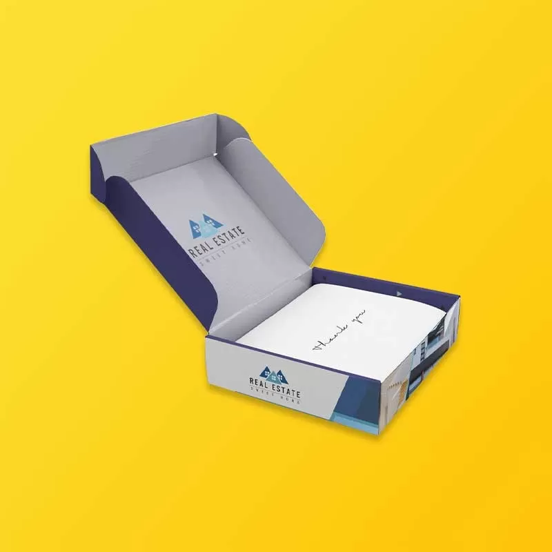
The same caution applies to corrugated packaging. Direct printing on a liner is different from printing a smooth sheet that is later laminated to corrugated board. Brisk’s Custom Design Printed Shipping Boxes can involve direct digital, flexographic, or litho-laminated approaches depending on the project. Each route has different expectations for detail, color, texture, and cost.
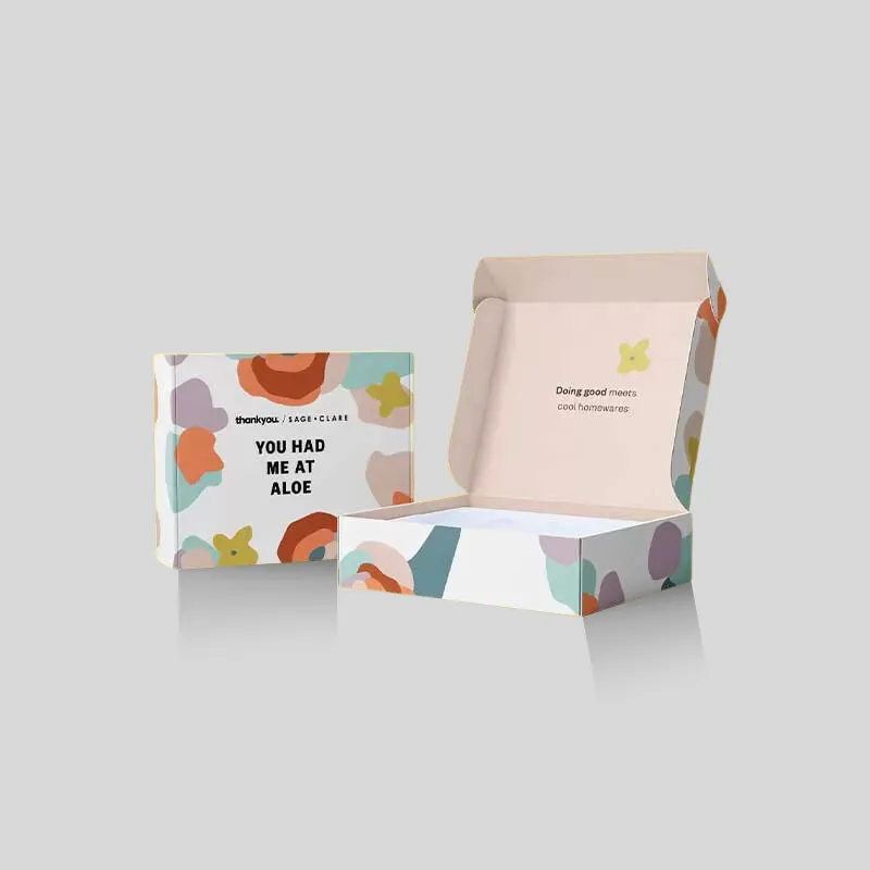
Print method matters as much as the color system
Do not finalize a color plan without confirming how the package will be printed. Digital equipment commonly interprets artwork through process-color workflows. Offset and flexographic presses can print process separations, spot inks, or a combination, subject to press capabilities.
The color-system question is therefore connected to, but distinct from, the print-method question. CMYK versus Pantone describes how colors are specified and separated. Digital versus offset or flexographic describes how the image is placed on the substrate.
Ask these questions early:
- Which printing process is planned for this quantity and structure?
- Can the equipment run true spot inks, or will Pantone targets be simulated with process colors?
- What color profile and file settings should the designer use?
- Is white ink needed on kraft or colored stock?
- What physical proof or sample is available before production?
If a supplier says it will “match Pantone” on a process-only device, clarify that this means a process simulation. Some targets can be approximated closely; others cannot. Agree on the proof that will define acceptance.
How finishes affect the final appearance
Lamination, aqueous coating, varnish, and specialty finishes can change how color looks. Gloss surfaces reflect more direct light and can make color appear deeper under some conditions. Matte finishes scatter light and may soften perceived contrast. Soft-touch films, textured coatings, foil, and Spot UV add further variables.
Finish selection should happen before final color approval. A proof on bare stock does not show exactly how the package will appear after lamination. If color is critical, request a sample that represents both the substrate and the finish, or ask how the supplier accounts for the finish in the approval process.
Also consider interaction with folds, scores, glue areas, windows, and foil. Heavy ink coverage or film can behave differently near structural features. Artwork review should evaluate production feasibility as well as color appearance.
A practical color-proofing workflow
The most reliable workflow moves from shared references to increasingly realistic physical evidence:
- Identify color-critical elements. Separate the signature logo and brand panels from less critical photos or background graphics.
- Confirm the substrate. Record board type, color, coating, flute or caliper, and whether a printed top sheet will be laminated.
- Confirm the print method. Find out whether the run will be digital, offset, flexographic, or a combination.
- Choose process, spot, or both. Base the separation on the artwork and production route.
- Supply proper references. Provide CMYK values and profiles where requested, exact Pantone references for spot targets, and an approved physical brand sample if available.
- Review separations and overprint settings. Ensure spot colors are named consistently and unintended RGB elements or duplicate swatches are removed.
- Approve a physical reference. Depending on the project, this may be a material swatch, ink drawdown, contract proof, press proof, or production sample.
- Record the approval. Keep the signed or approved reference with job specifications for reorders.
A PDF viewed on a laptop is useful for checking layout, copy, dielines, and obvious art errors, but it is not a dependable final color standard. Monitor calibration, brightness, ambient light, and RGB display gamut all affect what the reviewer sees.
Cost and quantity factors
There is no universal rule that CMYK is cheaper than Pantone or that spot color is always premium-priced. The production route determines the comparison.
Important quote factors include:
- Number of process and spot inks.
- Printing method and required plates or setup.
- Quantity per artwork version or SKU.
- Board type, liner color, and coating.
- Inside versus outside printing.
- Total ink coverage and whether white ink is required.
- Metallic, fluorescent, or custom-mixed inks.
- Lamination, varnish, foil, embossing, or Spot UV.
- Proof type, sampling, and press checks.
- Color tolerance and repeat-order expectations.
A one-color spot design may be efficient on one press, while a photographic CMYK design may be more efficient on another. Request comparable quotes using the same dimensions, quantity, material, finish, and proofing assumptions. Avoid choosing from color labels alone.
Artwork and quote checklist
Send Brisk a complete package so the color recommendation is tied to the real job:
- Final internal dimensions and selected box structure.
- Quantity for each SKU and artwork version.
- Board type, color, caliper or flute, and coating preference.
- Vector logo files and linked high-resolution images.
- CMYK profile or values requested by the production team.
- Exact Pantone references, including coated or uncoated designation where applicable.
- A list of color-critical elements and acceptable variation.
- Intended print method, if already decided.
- Inside and outside print coverage.
- Finish requirements and any white, metallic, or fluorescent ink.
- Preferred proof: digital layout proof, physical color proof, drawdown, or production sample.
- Delivery destination and required schedule.
Use Brisk’s quote form when the dimensions, quantity, material, and artwork direction are ready. If the color system is still uncertain, contact a packaging specialist to request an artwork review and relevant material or print samples.
Common mistakes to avoid
The first mistake is treating RGB or a HEX code as a complete print specification. Those values describe screen color; the printer needs an agreed physical or print-system target.
The second is selecting a Pantone number without stating coated or uncoated context. The suffix and substrate matter.
The third is approving color before selecting material and finish. A white coated carton, uncoated kraft mailer, and laminated corrugated box will not render the same ink identically.
The fourth is converting a spot color to CMYK and assuming the conversion is exact. It is an approximation whose appearance depends on the output profile and press.
The fifth is omitting physical proofing for a color-critical launch. A representative sample can reveal substrate and finish effects that are difficult to judge on screen.
FAQ
Is Pantone better than CMYK for packaging?
Neither is universally better. CMYK is versatile for photos, gradients, and multicolor artwork. Pantone spot inks can be useful for controlled solid brand colors or specialty ink effects. The best choice depends on the art, substrate, press, quantity, and acceptable color tolerance.
Can a Pantone color be printed in CMYK?
A printer can simulate many Pantone targets with CMYK, but the conversion is not always exact. Some spot colors fall outside a particular CMYK gamut. Review a proof made with the planned profile, equipment, and substrate before approving the conversion.
Why does my printed package look different from my screen?
Screens create color with RGB light, while print uses physical inks and reflected light. Monitor calibration, brightness, CMYK gamut, board color, ink absorption, finish, and viewing conditions can all create differences.
Should packaging artwork be supplied in RGB or CMYK?
Follow the printer’s specification. Packaging production files commonly require CMYK process colors plus separately named spot colors when needed. Do not convert files blindly; request the correct profile, PDF preset, bleed, and spot-color naming rules from the production team.
Does kraft board change CMYK or Pantone colors?
Yes. The brown base and uncoated surface can darken, warm, or mute inks compared with white coated stock. White ink, a white liner, or a printed sample may be needed when brightness or close matching matters.
What proof should I request for brand colors?
Ask which physical option best represents production: an ink drawdown, material swatch, contract color proof, press proof, or finished sample. The right choice depends on the print process and budget. A digital layout proof alone is not a final physical color reference.
Can I use CMYK and Pantone on the same box?
Yes, some conventional print jobs combine CMYK imagery with one or more spot colors. This can improve control of critical colors, but it may add inks, plates, setup, proofing, and cost. Confirm press capability before preparing separations.
What information prevents color delays?
Provide the final dieline, editable artwork, image links, fonts, substrate, quantity, print coverage, finish, CMYK profile, exact Pantone references, physical brand reference, and proofing requirement. Clearly mark which elements are color-critical.
Choose color after the material and press route are known
CMYK is usually the practical choice for photographs, gradients, and complex multicolor packaging. Pantone spot color is worth considering for controlled solid brand colors, simple limited-color graphics, and specialty inks. A combined strategy can serve both needs when the press and budget support it.
The safest decision is made with the complete system in view: artwork, substrate, structure, print method, finish, quantity, and proof. Send Brisk those details for a material-specific recommendation, sample, artwork review, and custom packaging quote before approving production color.