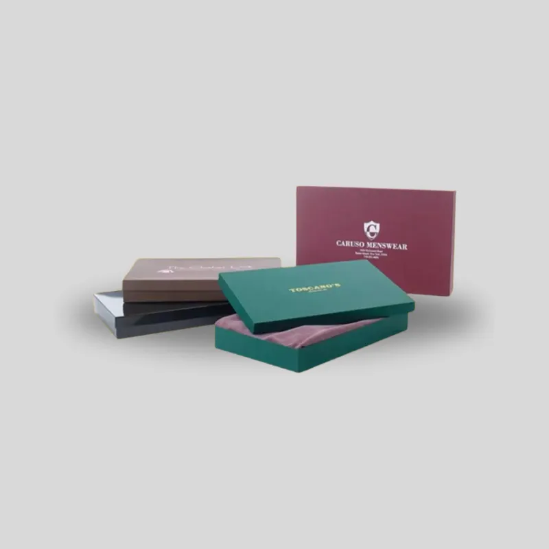
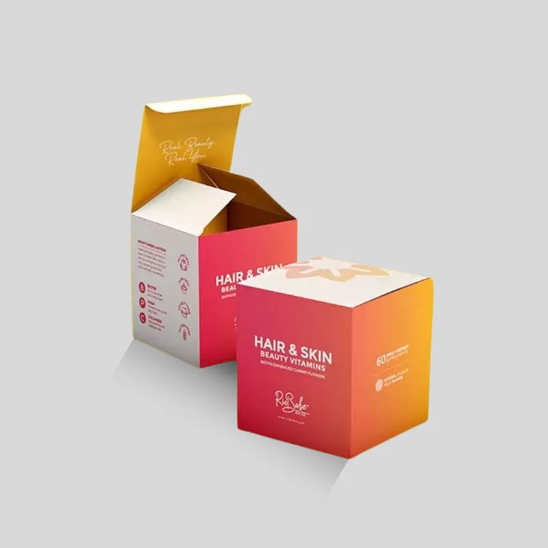
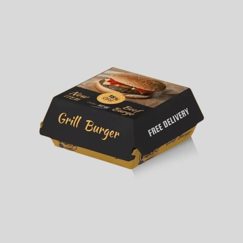
In the embossing vs debossing packaging decision, choose embossing when the logo or pattern should rise above the surface and create a more projecting, light-catching detail. Choose debossing when the mark should press into the surface for a quieter, recessed impression. Neither is automatically more premium or better. The right finish depends on the substrate, box construction, artwork, panel location, desired depth, other finishes, quantity, budget, and what the reverse side can show. Compare physical samples on the intended material before approving production.
Brisk provides dedicated options for embossing and debossing. This guide focuses on the narrower buyer decision between them, not on choosing the package structure itself.
Embossing vs debossing at a glance
Choose embossing when
- A raised logo, monogram, border, or simple pattern should be easy to see and feel.
- Light and shadow on the raised surface support a confident, dimensional presentation.
- The selected paperboard or wrap can hold the intended relief cleanly.
- Blind texture is desired without ink or foil, or a registered foil-and-relief effect is part of the brief.
- The back of the treated panel can accommodate the corresponding impression or will be concealed by the structure.
Choose debossing when
- A sunken mark fits a restrained, minimal, or architectural design language.
- The design should feel integrated into the surface rather than standing above it.
- A recessed logo on a lid, sleeve, label, card, or hang tag supports the hierarchy.
- The substrate and panel construction can accept the requested pressure and depth without unwanted cracking or show-through.
- Blind debossing, recessed foil, or another registered treatment has been sampled successfully.
These are starting points, not production specifications. A shallow emboss on one stock may be subtler than a deep deboss on another. Color, lighting, grain, lamination, artwork size, and surrounding negative space also change the result.
What embossing does to the packaging surface
Embossing reshapes a selected area so it stands above the surrounding surface. The production method generally uses a die and a matching counter to form the material under pressure. Brisk describes blind embossing, registered embossing over printed artwork, and combination foil embossing among its available approaches. Each has a different proofing and registration requirement.
A blind emboss uses the substrate itself as the visual. There is no added ink or foil on the raised area, so the result relies on contour, shadow, paper color, and touch. It can work well for a logo on a restrained carton, a repeat pattern on a gift package, or a tactile cue on a tag.
A registered emboss must align with a printed element. Misregistration that would be invisible in a blind finish can become obvious when a raised edge no longer follows the printed logo. Combination foil embossing introduces another visible material and should be evaluated for foil coverage, edge definition, relief, and alignment—not simply approved from a flat screen rendering.
What debossing does differently
Debossing presses the selected design into the surface, leaving a recessed impression. The valley catches shadow and creates tactile depth without projecting outward. This often suits a minimal wordmark, a small emblem with enough line weight, or a controlled mark on a rigid-box wrap.
The word “subtle” should not be mistaken for “invisible.” A deboss can be deep and assertive, while a shallow blind deboss may appear only as the package moves under light. Specify the intended effect with references and a physical target rather than asking only for “a premium deboss.”
Depth also has practical consequences. Brisk notes that a deep deboss on a thinner substrate can risk cracking or strike-through on the reverse. Panel support, material thickness, fibers, coatings, grain direction, and construction all matter. If the inside panel remains visible, review both sides of a production-representative sample.
Compare visual impact and brand tone
Embossing tends to project toward the viewer. Raised edges catch highlights, and the mark can feel active or celebratory. Debossing tends to draw the eye inward. Its recess can feel controlled, quiet, and permanent. Those associations are useful creative shorthand, but they are not rules.
A bold deboss can command more attention than a delicate emboss. A large blind embossed pattern may feel understated when it uses the same color as the board. A metallic foil can dominate either treatment. Before choosing, ask what the finish must do:
- Make a logo noticeable at shelf distance
- Reward close inspection during unboxing
- Add tactile identity without another printed color
- Separate a master brand from variant information
- Create a pattern across an otherwise plain panel
- Coordinate a box, label, insert card, and hang tag
Use the finish for one clear job. Applying relief to every line of copy can flatten the hierarchy and create production problems. Often the strongest result is one properly sized brand mark surrounded by enough clear space.
Match the finish to the substrate and structure
Material selection should happen before the die is finalized. Folding-carton paperboard, rigid-box wrap, art card, kraft paper, coated stock, and textured papers respond differently to pressure. A converter should assess the exact specification rather than approving a generic phrase such as “thick cardstock.”
Folding cartons are formed from paperboard panels. Relief can affect the visible front and reverse of that panel, so placement near scores, folds, glue areas, windows, perforations, and edges needs review. Excessive pressure or unsuitable depth may weaken or distort a sensitive area.
Rigid boxes usually combine a rigid board base with a separate wrap. The visible surface treatment may be applied to the wrap as part of the manufacturing sequence. The wrap’s thickness, texture, coating, adhesive, and support beneath it influence sharpness. If a deep impression is required through the assembled surface, discuss that requirement explicitly.
Corrugated packaging adds liner and flute considerations. A result that looks crisp on smooth carton board may not reproduce identically on a corrugated liner. For shipping packaging, also ask whether transit abrasion, tape, labels, and handling will obscure or damage the effect. Browse Brisk’s wider packaging finishes, but confirm compatibility against the chosen product and material.
Prepare artwork for a cleaner result
Start with editable vector artwork and identify the exact area to raise or recess. The finish layer should be clearly separated from print, foil, spot coating, cut, score, and safe-area information. Do not rely on a low-resolution image or a note that says “emboss the logo” without defining which elements belong in the die.
Simplify where needed. Fine strokes, tiny counters inside letters, tightly spaced details, gradients, shadows, and photographic textures may not translate into formed relief as expected. The minimum practical line, gap, type size, and depth depend on the substrate and die process, so obtain project-specific guidance rather than copying a universal online number.
Evaluate these details on the dieline:
- Size: Is the mark large enough for its internal spaces and edges to form clearly?
- Line weight: Will narrow strokes hold, close up, or appear uneven?
- Clearance: Is the finish safely away from cuts, folds, glue, windows, and critical copy?
- Panel orientation: Which surface is visible, and what appears on its reverse?
- Registration: Must the relief align with ink, foil, or spot coating?
- Variable artwork: Does every SKU use the same finish die, or does each variation require different tooling?
- Reading order: Does texture reinforce the logo, or compete with product name and required information?
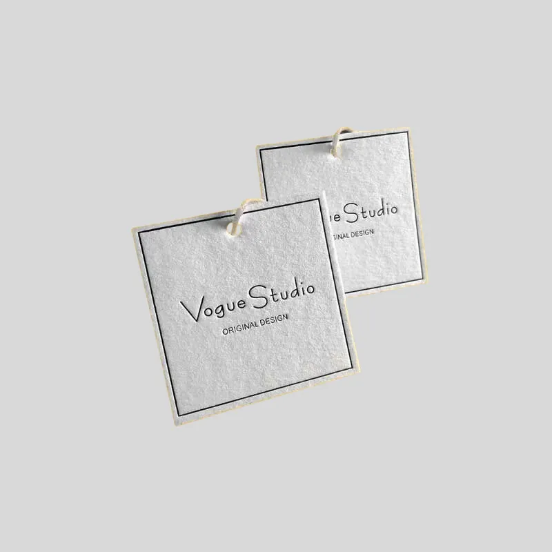
Brisk’s custom embossed and debossed hang tags provide a useful small-format reference. A tag is not a substitute for testing a carton or rigid box, but it can help a team discuss raised and recessed effects with physical examples.
Decide between blind, foil, print, and coating combinations
“Embossed” and “debossed” do not fully define the finished look. State whether the formed area is blind, registered to ink, combined with foil, or paired with another coating.
Blind emboss or deboss
The substrate color remains the main color. This approach emphasizes form and can reduce competition with printed graphics. Contrast changes with viewing angle, so inspect samples in the lighting where the product will be sold or photographed.
Foil with relief
Foil adds reflectivity or pigment to the raised or recessed element. It can improve distance visibility, but it also introduces foil selection, die setup, heat, pressure, coverage, and registration decisions. Review narrow gaps, edges, fill, and how the foil behaves over the chosen surface.
Ink registered to relief
Printing and formed detail can create a clear dimensional logo when alignment is controlled. Ask what tolerance is achievable for the specific process, size, and substrate. Build artwork with realistic production allowances rather than assuming screen-perfect overlap.
Lamination or textured papers
Matte, gloss, and soft-touch surfaces alter appearance and hand feel. Textured paper can complement a blind treatment but may reduce the visual sharpness of fine detail. A coating or film can react to forming differently from uncoated stock. The sample must use the intended material stack, not a convenient substitute.
Compare cost without assuming one is always cheaper
Both techniques can require custom tooling and production setup. It is unsafe to say that embossing or debossing is always the lower-cost choice. Pricing can change with:
- Die and counter requirements
- Artwork dimensions, complexity, and relief depth
- One-level versus sculpted or multi-level detail
- Substrate, coating, lamination, and box construction
- Blind treatment versus foil, ink, or spot-coating registration
- Number of package SKUs and unique finish artworks
- Quantity per design and repeat-order plan
- Proof type, sample rounds, spoilage allowance, and quality checks
- Manual handling or additional manufacturing passes
- Timeline, freight, and delivery location
Compare quotes using the same box, dimensions, material, artwork, quantity, finish area, and proofing assumptions. A cheaper unit price does not help if detail fills in, the reverse side is unacceptable, or the die must be remade after an avoidable artwork change. Freeze structure and critical copy before commissioning final tooling when possible.
Approve with physical evidence, not a digital mockup alone
A digital proof can confirm spelling, placement, color callouts, and which artwork layer receives the finish. It cannot fully reproduce depth, pressure, shadow, paper movement, foil reflection, or touch. Use it as one approval stage, not the only evidence for a tactile feature.
A practical sequence is:
- Review existing finish samples on materials close to the intended specification.
- Finalize the structure and dieline before locking finish placement.
- Supply clean vector artwork with separate production layers.
- Approve a digital proof for content and positioning.
- Request the appropriate physical or production-representative sample when risk, value, novelty, or registration warrants it.
- Inspect front, reverse, edges, folds, foil coverage, color, depth, cracking, and alignment.
- Photograph the sample under diffuse and directional light.
- Confirm the signed reference and tolerances used for production quality control.
Brisk offers a sample request route. Ask what kind of sample is available for your exact structure and finish; a stock sample demonstrates possibilities, while a project-specific sample may be needed to validate unique artwork and material interaction.
Quote checklist for embossing or debossing
Send enough detail for the supplier to evaluate the complete specification:
- Product type, box style, internal dimensions, and intended use
- Flat dieline and identification of the treated panel
- Exact substrate, thickness or grade, wrap, liner, coating, and lamination
- Print process, colors, and coverage
- Vector artwork with a separate emboss or deboss layer
- Finished size and location of every tactile element
- Blind, printed, foiled, or coated finish requirement
- Desired relief character: restrained, prominent, single-level, or sculpted
- Reverse-side appearance requirements
- Clearance from scores, cuts, edges, glue areas, windows, and perforations
- Quantity per size and artwork, annual forecast, and reorder plan
- Digital proof, physical sample, and approval expectations
- Quality criteria for registration, depth, edges, cracking, and foil coverage
- Packing, freight, timeline, and destination
Ask the quote to state tooling, proofing, finishing, and freight assumptions separately enough to compare options. If you are still deciding, request one embossing alternative and one debossing alternative on the same base specification.
Common mistakes to avoid
Choosing from a flat rendering
A shadow effect in design software is not formed paper. Handle a relevant sample.
Finalizing the die before the structure
A later panel, fold, or logo-size change can make tooling obsolete. Lock the dieline first.
Using detail that is too fine for the material
Screen artwork has no fibers, coatings, or pressure limits. Let the converter review the production file.
Ignoring the reverse side
Raised and recessed forming can influence the opposite face. Check it, especially when both sides remain visible.
Combining too many premium signals
Foil, relief, spot gloss, full print, texture, and complex patterns can compete. Establish hierarchy and remove treatments that do not serve it.
Comparing unequal quotes
One quote may include registered foil and a physical proof while another covers blind debossing only. Normalize the specification before judging price.
FAQ
What is the main difference between embossing and debossing?
Embossing creates a raised design above the surrounding surface. Debossing presses a design into the surface to create a recess. Actual visibility and feel depend on depth, material, size, light, and any ink, foil, or coating used with the finish.
Is embossing better than debossing for a logo?
Not universally. Embossing often suits a logo intended to project outward, while debossing often suits a restrained mark that feels integrated into the surface. The logo’s line weight, size, substrate, panel, and surrounding design should decide the treatment.
Can embossing and debossing be used without ink or foil?
Yes. These are commonly called blind embossing and blind debossing. They rely on shape, shadow, substrate color, and texture. Review them in realistic lighting because contrast can be subtle from some angles.
Can either finish be combined with foil stamping?
Yes, when the artwork, material, tooling, and production process support the combination. Foil introduces additional coverage and registration considerations, so approve a suitable proof and inspect a physical reference.
Do these finishes work on rigid boxes and folding cartons?
Both can be considered for rigid boxes and folding cartons, but they interact with the structures differently. A folding-carton panel and a wrapped rigid-box lid are not the same substrate system. Confirm the exact stock, wrap, backing, coating, panel location, and desired depth with the manufacturer.
Which finish costs more?
There is no reliable universal answer. Tooling configuration, complexity, size, depth, material, foil or coating, registration, quantity, proofing, and manufacturing sequence affect pricing. Request both alternatives against one controlled specification.
Will embossing or debossing show on the back of the panel?
It can. The extent depends on the process, substrate, depth, backing, and construction. If the reverse remains visible, state that in the brief and inspect both sides of a representative physical sample.
What artwork file should I provide?
Provide editable vector artwork, commonly in an agreed AI, EPS, or vector PDF format, with the tactile element on a clearly named separate layer. Include the dieline and keep print, foil, coating, cut, and score information distinct.
Should I order a sample before production?
For a new material, unusual depth, fine detail, visible reverse, or registered foil treatment, a project-specific physical sample can reduce uncertainty. At minimum, handle relevant stock finish samples and confirm what the digital proof does and does not represent.
Choose the finish as part of the whole package
Embossing raises the design; debossing recesses it. The useful decision goes beyond that definition. Match the direction of relief to the brand hierarchy, then validate material, artwork, panel location, reverse-side appearance, secondary finishes, tooling, cost assumptions, and production controls.
Start with samples on comparable materials, finalize the dieline, and ask for both options on the same specification if the creative direction is still open. Explore Brisk’s custom rigid boxes for one relevant packaging context, then contact a packaging specialist for material guidance, dieline/design support, samples, and an embossing-versus-debossing quote built around your actual artwork.