To prepare artwork files for custom packaging, begin with the packaging supplier’s current, approved dieline and written prepress specification. Build artwork on separate, clearly named layers; extend backgrounds through the required bleed; keep logos, text, barcodes, and other critical content inside the specified safe area; use the requested color setup; provide usable images and fonts; and isolate foil, white ink, Spot UV, embossing, or other special processes. Preflight the final-size file, remove obsolete elements, export in the requested format, and approve the proof before production.
That short workflow prevents many avoidable revisions, but there is no universal file recipe. Bleed, safe area, image resolution, minimum line weight, color profile, barcode requirements, and accepted formats vary by printer, material, box structure, and print process. Treat this guide as a preparation framework and the supplier’s project-specific instructions as the controlling requirements.
Collect the right information before designing
Artwork should follow the package, not force the package into a graphic layout created too early. Confirm the product and structural brief first:
- Finished internal dimensions and how they were measured
- Product weight, fragility, orientation, and packing method
- Box style, closure, inserts, windows, handles, and tear features
- Material, thickness, flute or board grade, and printable surface
- Print process and whether printing appears outside, inside, or both
- Required finishes and where each finish belongs
- Quantity for every size, design, language, and product variant
- Shipping, retail, storage, scanning, and photography conditions
- Required statements, symbols, warnings, dates, or variable data
- The supplier’s current dieline, artwork specification, and accepted file types
If dimensions or structure change, request a revised dieline. Stretching old artwork onto a new net can shift panel boundaries, distort graphics, and put copy into folds or glue areas.
Brisk’s custom design printed shipping boxes provide a useful corrugated context: the verified product API lists direct digital, litho-laminated, and flexographic options. Those processes do not share identical prepress needs, so confirm the chosen route before finalizing color, images, and fine detail.
Understand what the dieline shows
A packaging dieline is the flat production map for cutting, creasing, folding, gluing, and placing artwork. Its guides may identify cut lines, crease or score lines, perforations, glue flaps, bleed boundaries, safe areas, windows, openings, and panel orientation.
Before adding design:
- Confirm the dieline version, finished dimensions, and scale.
- Ask what every line style and color means.
- Lock the technical layer so guides are not moved accidentally.
- Keep guides on their designated layer rather than merging them into artwork.
- Identify front, back, sides, top, bottom, inside, and glue panels.
- Make a plain-paper mockup when orientation is not obvious.
- Check how artwork crosses folds and meets at edges.
Do not assume the visually largest rectangle is the front. A folded carton or mailer can rotate panels during assembly, and copy that looks upright on the flat file may appear upside down on the finished box. Mark one physical mockup and compare it with the on-screen net.
Set bleed and safe zones from the supplier specification
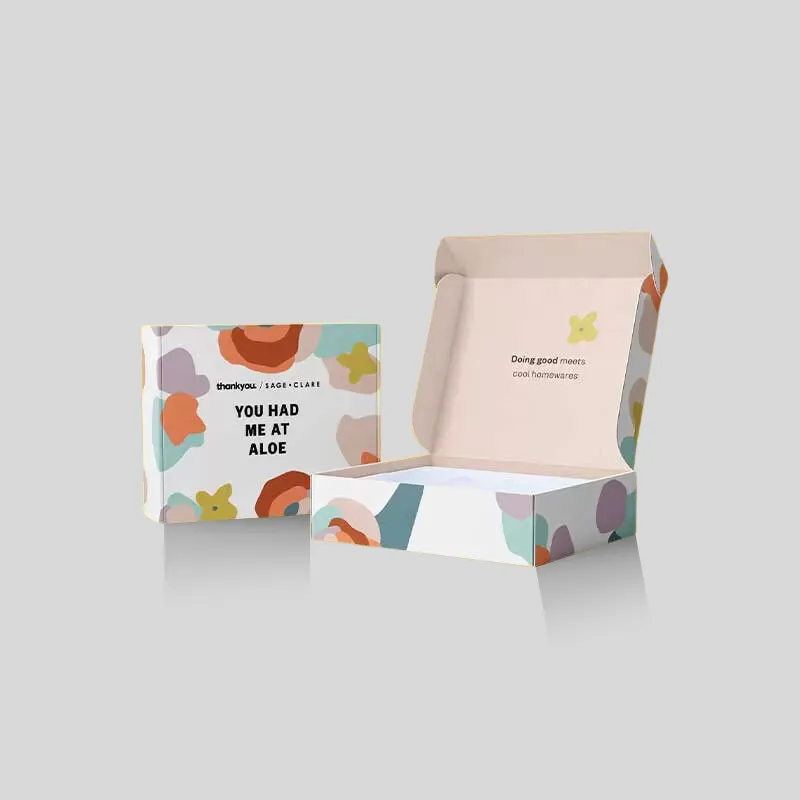
Bleed extends background color, patterns, or images beyond the final cut. It allows normal cutting variation without leaving an unintended unprinted edge. A safe zone keeps essential elements away from cuts, folds, scores, perforations, and other areas where placement variation or structural movement could affect them.
Use the exact bleed and safe-area values supplied for the job. Generic online measurements can be useful examples, but they are not approval for your production file. Requirements can change with format, equipment, material, and structure.
A practical review should ask:
- Do all edge-to-edge backgrounds continue fully through the bleed boundary?
- Are headlines, logos, ingredient text, instructions, and legal copy within the approved safe area?
- Are barcodes and QR codes clear of folds, corners, seams, glue, curves, and rough surfaces?
- Has artwork crossing a score been evaluated on a folded sample?
- Are adjoining panels intentionally aligned, with normal production movement considered?
- Are glue flaps and adhesive zones free of print or coating where required?
Avoid creating a decorative border very close to a cut edge unless the supplier confirms it is practical. Small positional movement can make an otherwise even border look visibly unbalanced.
Choose color settings deliberately
A monitor emits light; printed packaging reflects it. Substrate color, ink, coating, lamination, surface texture, print method, and lighting all affect the result. Ask for the required color mode, profile, ink setup, and spot-color naming convention rather than converting files blindly.
Process and spot colors
CMYK process printing builds color from cyan, magenta, yellow, and black. Spot colors use named ink references or dedicated separations. A brand may use process equivalents for some jobs and a specified spot ink for others. Decide which is required, keep intentional spot colors named consistently, and remove accidental duplicates.
Do not promise an exact screen-to-print match. Supply approved color references when color is critical, and request the appropriate proof or sample. Natural kraft, white paperboard, coated stock, and corrugated liners can render the same values differently.
Black artwork
Small black text and barcodes often require a simpler black construction than large dark backgrounds, but the correct recipe depends on the printer and process. Never use the registration color for design elements: registration marks are intended to print on every separation. Ask the supplier for approved black builds and trapping guidance.
Brisk's matte lamination and gloss lamination pages show two relevant surface options. Select the finish before final color approval, then judge the real material stack rather than an unlaminated sheet.
Prepare images, vectors, fonts, and fine details
Keep logos, line art, icons, dielines, and small typography as vector artwork where practical. Raster images should have enough effective resolution at their final placed size—not merely a large pixel count before enlargement. Ask the printer for the target resolution and supported image formats.
Before handoff:
- Inspect every linked image at final size.
- Replace missing, low-resolution, or unintentionally compressed assets.
- Embed or package links according to the supplier’s workflow.
- Remove hidden duplicates and images outside the artboard that are not needed.
- Check transparency, overprint, masks, gradients, and blend effects.
- Confirm minimum type size, reversed type, rule weight, and knockout details.
- Outline final approved fonts if requested, while retaining an editable master file.
- If fonts remain live, package the permitted font files and check licensing.
- Review spelling, quantities, units, punctuation, and language versions independently.
Outlining text can reduce missing-font problems, but it also makes copy harder to edit. Never outline the only master. Save an editable source before creating the production handoff.
Protect barcodes, QR codes, and required information
A code that looks correct on screen can fail after scaling, printing, coating, folding, or placement on a curved or textured panel. Generate codes from the correct data, preserve required quiet zones, avoid casual stretching, and follow the code owner’s size, contrast, and verification rules.
Place codes on a suitable, reasonably flat area with adequate contrast. Avoid folds, seams, perforations, corners, metallic effects, transparent windows, heavy texture, or glare-prone surfaces unless testing supports the choice. Print a final-size test, but do not treat a phone scan as formal verification. Retailers, logistics partners, marketplaces, and regulators may impose their own requirements.
Required packaging copy deserves a separate content review. The printer can check production setup but should not be assumed to certify claims or legal compliance. Have qualified internal or external reviewers approve ingredients, warnings, symbols, origin statements, translations, and category-specific requirements before locking artwork.
Put finishes and technical effects on separate layers
White ink, foil, Spot UV, varnish, embossing, debossing, cutouts, windows, perforations, and variable data should be clearly distinguished from ordinary print. Use the supplier’s naming, spot-color, overprint, and preview conventions.
A clean layer structure might separate:
- Dieline and technical guides
- Main process artwork
- Intentional spot colors
- White ink or underprint
- Foil stamping
- Spot coating or Spot UV
- Embossing or debossing
- Cutout or window instructions
- Notes and nonprinting annotations
Do not simulate a finish only with a visual effect and expect production to infer it. A gold gradient is printed artwork, not automatically a foil plate. A shadow is not an embossing instruction. Define each manufacturing operation explicitly and confirm whether the supplier wants positive or reversed artwork.
For formed finishes, compare Brisk's embossing and debossing options, then discuss minimum detail, depth, panel position, material, grain, and registration. Fine isolated details that look attractive in a rendering may not form or register reliably on the selected construction.
Preflight before exporting
Run both software preflight and a human review. Automated checks can identify missing fonts, low-resolution images, color-space issues, overset text, or objects outside specifications, but they cannot decide whether the nutrition panel is on the right face or the opening instructions make sense after folding.
Use this final preflight sequence:
- Verify job name, SKU, size, version, language, and dieline revision.
- Confirm document scale, artboard, panel orientation, and structural guides.
- Check bleed, safe areas, folds, glue zones, windows, and code placement.
- Review colors, spot names, black builds, overprint, and transparency.
- Inspect image resolution, links, vectors, fonts, and small details.
- Toggle every finish layer and compare it with the main artwork.
- Remove unused swatches, hidden objects, obsolete concepts, and stray marks.
- Spell-check, then perform a manual copy and number review.
- Export only in the requested format and preset.
- Reopen the exported file and inspect every page at high zoom.
- Print a reduced and final-size reference where practical.
- Package the source, links, fonts if permitted, and a reference PDF as requested.
Use descriptive filenames with version control, such as brand-product-size-artwork-v07-approved, rather than final-final-new. Keep one decision owner responsible for releasing the approved revision.
Approve proofs and samples carefully
A proof is an approval tool, but different proofs answer different questions. A PDF can confirm copy, layers, placement, separations, and general layout. It cannot reproduce material feel, white ink opacity, metallic reflection, lamination glare, folding behavior, exact registration, or transit performance.
Ask what the proof represents and what it does not. Review it at 100 percent and final size; compare it with the order specification and approved dieline; and record corrections in one consolidated response. When structure, fit, color, finish interaction, scanning, or product presentation is critical, request a suitable physical or production-representative sample.
Brisk provides a sample request. Clarify whether the sample is a generic material/finish reference, a structural blank, a digitally printed prototype, or production-representative output. Each supports a different decision.
Artwork handoff and quote checklist
Send the packaging specialist one controlled package containing:
- Product name, dimensions, weight, orientation, and packing method
- Box style, material, board grade or flute, inserts, windows, and closures
- Quantity by size, design, SKU, and language
- Current approved dieline and version identifier
- Editable source file plus requested production PDF or other format
- Linked images, fonts where licensing permits, and color references
- Print process, printed sides, spot colors, white ink, and black requirements
- Separate labeled layers for every coating, foil, relief, cut, or variable feature
- Barcode data, owner requirements, and verification responsibility
- Required copy and the name of the person who approved it
- Proof/sample level, acceptance criteria, destination, and target schedule
- One contact authorized to answer prepress questions and approve changes
Brisk’s custom cardboard shipping boxes and printed shipping-box product pages provide project context, while a specialist can confirm the correct dieline and file requirements for the actual structure.
Common packaging artwork mistakes
Designing before structure is approved
Panel sizes and orientation can change. Lock the structural direction first.
Moving or flattening dieline guides
Keep technical lines intact and separate so prepress can inspect them.
Using one generic bleed value for every supplier
Use the written requirement for the actual job.
Keeping critical copy too close to folds or cuts
Safe areas reduce the risk of visibly misplaced or compromised information.
Treating screen color as a contract proof
Approve color through the proofing method appropriate to the substrate and process.
Merging foil, white ink, or Spot UV into ordinary graphics
Special operations need explicit, separately inspectable production artwork.
Scaling a barcode to fit leftover space
Plan code placement early and verify against the code owner’s requirements.
Sending multiple conflicting “final” files
Use controlled filenames, one release owner, and one approved package.
FAQ
What file format is best for packaging artwork?
There is no single format for every supplier. Print workflows commonly use editable vector source files and production PDFs, but accepted versions, presets, image links, and font handling vary. Ask for the printer’s written specification before exporting.
What is a packaging dieline?
A dieline is the flat technical layout showing how packaging is cut, creased, folded, glued, and assembled. It also guides panel orientation, bleed, safe areas, windows, and artwork placement.
How much bleed should packaging artwork have?
Use the value specified by the supplier for that structure and print process. Do not apply an online default without confirmation, because equipment, materials, and converting requirements differ.
Should packaging files use CMYK or Pantone colors?
The print provider should specify the color setup. CMYK is common for process printing, while named spot inks may be used for critical brand colors or special operations. Some jobs combine both.
Should fonts be outlined?
Outline final approved text if the supplier requests it, but preserve an editable master. If live fonts are required, package them only when licensing permits and confirm that prepress can access them.
How should foil, Spot UV, or embossing be shown?
Place each process on its own clearly named layer or separation using the printer’s naming, spot-color, and overprint convention. Include a visual reference, but do not rely on the mockup alone as a production instruction.
Is a digital proof enough before printing boxes?
It can be enough for some low-risk checks, but it cannot fully show structure, material, exact color, texture, gloss, metallic effects, forming, or fit. Request an appropriate physical sample when those factors affect approval.
Can a packaging supplier fix my artwork?
Many suppliers offer prepress or design support, but scope varies. Ask whether they will only flag issues, make technical adjustments, or develop artwork. The brand should still approve copy, claims, codes, dimensions, and the final proof.
Prepare one controlled file, then ask for a technical review
A strong packaging handoff is not simply a beautiful PDF. It connects approved structure, accurate content, controlled color, usable assets, explicit manufacturing layers, and a traceable proof decision. Start with the current dieline, follow written supplier requirements, preflight at final size, and keep one approved revision.
Use Brisk’s contact page to request dieline and design support. Share your product dimensions, box style, material, quantity, artwork status, print/finish plan, and destination so a packaging specialist can review the correct production path and prepare a relevant quote without publishing assumptions as specifications.