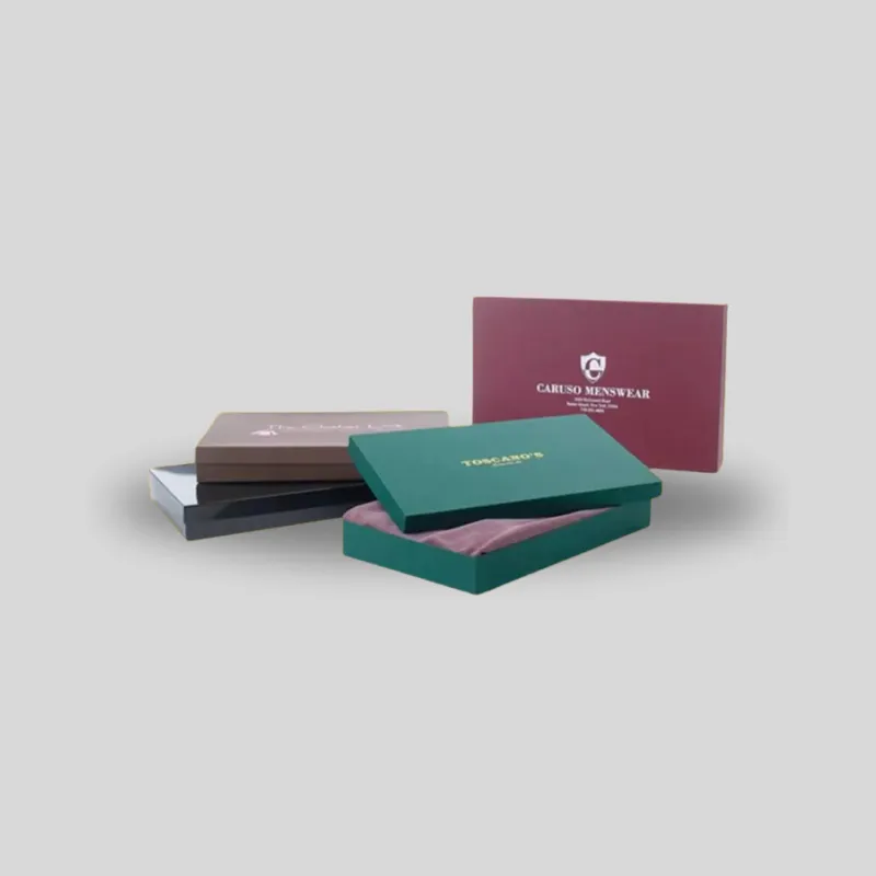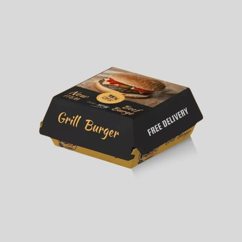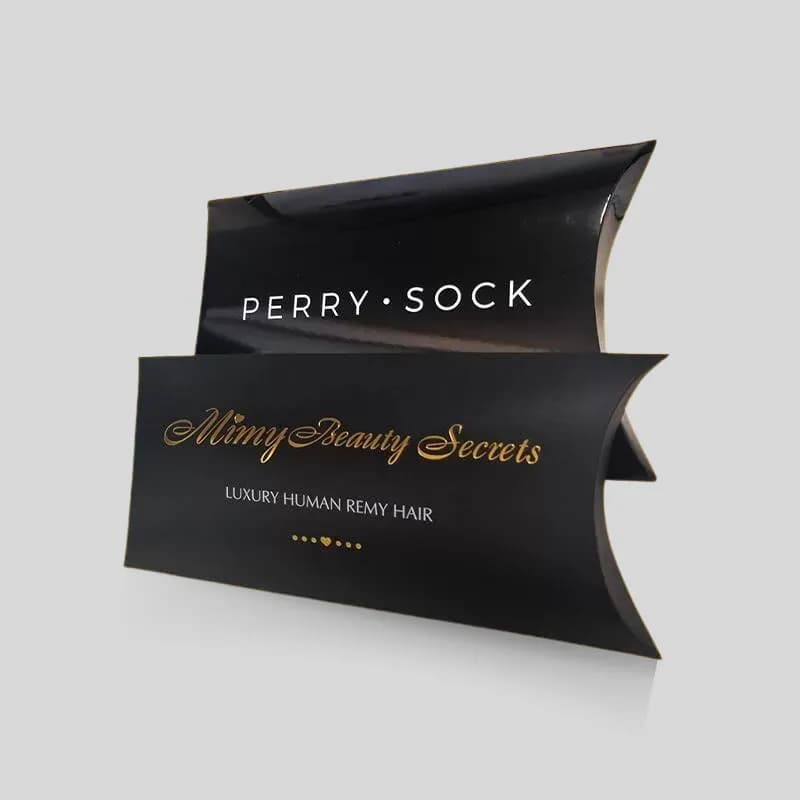
For the matte vs gloss lamination packaging decision, choose matte when you want lower glare, a restrained surface, and clean contrast with selective gloss details. Choose gloss when you want a reflective surface, stronger apparent color saturation, and energetic image-led graphics. Neither option is automatically more premium or more durable. The right choice depends on the artwork, lighting, substrate, box structure, handling, photography, secondary finishes, budget, and recovery requirements. Approve a physical sample using the intended material rather than choosing from a screen alone.
Brisk offers dedicated matte lamination and gloss lamination options. This guide helps buyers choose between those surfaces; the finish pages remain the primary specifications for each service.
Matte vs gloss lamination at a glance
Choose matte lamination when
- Low glare helps typography, instructions, or restrained photography remain readable under display lighting.
- A subdued, smooth surface fits beauty, lifestyle, jewelry, or premium retail positioning.
- Spot UV or another selective glossy detail should contrast with the base surface.
- The color plan can tolerate slightly less apparent saturation than a gloss surface.
- The team has tested dark solids for fingerprints, rubbing, and visible surface variation.
Choose gloss lamination when
- Bright color, high contrast, product photography, or illustrated graphics lead the design.
- A reflective, polished surface fits the category and shelf environment.
- The package will benefit from a smooth, wipeable outer film, subject to project-specific testing.
- Glare will not interfere with small text, barcodes, photography, or product information.
- The creative team wants broad shine rather than selective shine on only a logo or image.
Side-by-side decision factors
- Reflection: Matte diffuses light; gloss reflects it more directly.
- Color impression: Matte generally subdues the surface; gloss can make color appear deeper and more saturated.
- Reading conditions: Matte often reduces distracting glare; gloss should be checked under the actual shelf or studio lights.
- Touch: Matte feels smoother and quieter; gloss feels slick and polished. Exact feel varies by film.
- Fingerprint visibility: Do not rely on a universal rule. Very dark matte surfaces may show oils, while gloss can reveal prints and handling marks under directional light.
- Design combinations: Matte is a common base for spot gloss contrast. Gloss can be paired with foil or formed details, but the hierarchy should remain clear.
What lamination adds to printed packaging
Lamination bonds a thin film to a printed surface. It changes reflectance, touch, color appearance, and resistance to routine handling. It may also influence scoring, folding, gluing, die cutting, foil, embossing, recycling, and how the package behaves at edges. Those effects depend on the complete material stack and manufacturing sequence.
“Matte” and “gloss” describe appearance, not a complete technical specification. Film chemistry, thickness, adhesive, print process, ink coverage, substrate, surface energy, production equipment, and quality controls can differ. Ask the converter to define the proposed construction instead of treating every matte or gloss laminate as identical.
Lamination is also not the same as varnish, aqueous coating, or UV coating. Each can create matte or glossy appearances, but the application method, protection, fold behavior, recyclability implications, cost, and ability to cover selected areas can differ. If a quote says only “matte finish,” clarify whether it means film lamination, coating, varnish, uncoated paper, or another surface treatment.
Compare appearance, color, and brand tone
Matte lamination reduces sharp reflections and creates a controlled visual field. On typography-led packaging, that can help the eye move through the brand name, product name, variant, and required information without bright hotspots. It often supports minimal layouts, muted palettes, and generous negative space.
Gloss lamination creates highlights as the package moves. Those reflections can add visual energy and can make saturated colors and photographs appear more vivid. This can work well for illustrated food cartons, toy packaging, image-led consumer goods, and designs that depend on strong contrast.
These associations are not rules. A monochrome gloss box can feel highly controlled, while a brightly printed matte carton can be playful. Start with the brand and communication task:
- What must be noticed first at shelf or thumbnail size?
- Will the package be viewed under overhead retail lights, daylight, event lighting, or a phone camera?
- Does accurate reading matter more than broad shine?
- Are photographs, metallic effects, black fields, or fine typography central to the design?
- Should the finish feel quiet throughout, or create movement as the package turns?
Print the actual artwork. A generic white sample can demonstrate touch but cannot reveal what the laminate does to your colors, shadows, skin tones, black areas, or fine text.
Evaluate readability and photography
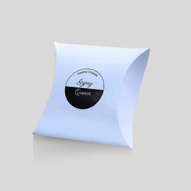
Gloss reflections can obscure small copy from some angles even when the print itself is sharp. Test ingredients, warnings, instructions, barcodes, QR codes, and low-contrast type under likely lighting. This is particularly important when critical information sits on a curved pillow box or near a fold.
Matte reduces broad glare, but it cannot ensure perfect legibility. Low-contrast color choices, small type, thin strokes, textured stock, and weak print density can still make information difficult to read. Accessibility begins with typography and contrast; finish selection supports those choices rather than replacing them.
For e-commerce, photograph physical samples before approval. Gloss may create attractive highlights but require careful light placement to avoid blown-out reflections. Matte is often easier to light evenly, yet dark matte surfaces can reveal oils, rubs, or unevenness in close-up images. Test front, side, three-quarter, macro, and video views rather than judging one retouched hero image.
Compare handling, scuffs, and moisture exposure
Both laminates can add a protective film over print, but “protected” does not mean indestructible or waterproof. Performance varies with film, adhesive, substrate, ink, edges, folds, rub points, temperature, humidity, chemicals, transit, and handling. A package for a dry retail shelf has different risks from a mailer exposed to conveyor belts or a cosmetic carton handled around oils and liquids.
Check representative samples for:
- Scuffing on large dark or solid-color areas
- Fingerprints under normal and directional light
- Cracking, whitening, or lifting at scores and folds
- Delamination around die-cut windows and edges
- Rub marks where boxes contact during packing and transit
- Adhesion in glue zones and compatibility with labels or seals
- Resistance to the product’s realistic environment
Do not infer food-contact, chemical resistance, water resistance, or regulatory suitability from a finish name. Tell the packaging specialist what the product contains, where the laminate sits, and what exposure is expected. Confirm applicable requirements for the complete package with qualified suppliers and advisers.
Match lamination to material and box structure
Smooth coated paperboard often displays print and film differently from natural kraft, textured paper, corrugated liner, or a rigid-box wrap. A laminate can reduce the apparent character of a textured stock, while an uneven surface may reduce visual uniformity. Request a sample on the selected substrate, not merely the same color.
Folding cartons require reliable scoring and folding. Lamination should be considered when the dieline, grain direction, scores, windows, perforations, glue flaps, and folds are engineered. A surface that looks excellent while flat can reveal stress at a tight fold.
Rigid boxes commonly use a printed or specialty-paper wrap over chipboard. The wrap bends around edges and corners, where film flexibility and adhesive performance matter. Brisk’s custom rigid boxes show a relevant structure, but the final wrap and finish still need project-specific testing.
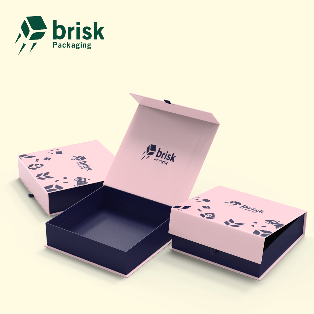
Curved pillow cartons introduce another viewing condition: reflections move across the curve and folds experience concentrated stress. Brisk’s custom matte finish pillow boxes provide a useful product context for discussing those effects.
Combine lamination with spot UV, foil, or relief carefully
A matte base with spot UV can create a clear gloss-on-matte contrast. Use the selective coating to direct attention to a logo, product name, pattern, or image—not every element. Confirm registration tolerance, minimum line and gap guidance, and whether the intended ink and laminate accept the coating reliably.
Foil stamping adds metallic or pigmented contrast. Its adhesion, edge definition, heat, pressure, and registration should be tested with the specified laminate. A combination that works on one matte film may not behave identically on another.
Embossing and debossing physically form the material. Lamination can influence cracking, stretching, sharpness, and surface response. Structure also changes how finishes are applied, so compare rigid boxes vs folding cartons before finalizing the material stack, then have the supplier assess the entire print-laminate-forming sequence.
Avoid stacking finishes merely because each sounds premium. Matte, spot UV, foil, embossing, and dense print can compete for attention and add proofing, tooling, production, and quality-control requirements. Give every finish one job in the visual hierarchy.
Compare cost using one controlled specification
Neither matte nor gloss is always cheaper. Price can change with film type and thickness, sheet size, substrate, quantity, print method, coverage, structure, secondary finishes, setup, spoilage, proofing, packing, and freight. Compare options against the same dieline, material, artwork, quantity, and service assumptions.
Ask quotes to identify:
- Exact lamination type and whether it covers one side or both
- Substrate, caliper or grade, and printed ink coverage
- Quantity per size and artwork version
- Spot UV, foil, embossing, windows, or other post-lamination work
- Proof and physical sample stages
- Tooling, setup, and repeat-order assumptions
- Packing, freight, timeline, and destination
A lower unit quote is not a saving if glare makes information unreadable, the film cracks at a score, or the color no longer matches the approved brand reference.
Ask better sustainability questions
Do not label either surface “eco-friendly” from appearance alone. A laminate changes the material construction and may affect how a package can be collected, sorted, separated, pulped, or recycled in a given market. Outcomes depend on film and adhesive, substrate, coatings, inks, labels, windows, local infrastructure, and contamination.
Ask the supplier for the material specification and evidence behind environmental statements. Then check requirements in the actual sales and recovery markets. Useful questions include whether a film-free coating can meet the performance need, whether less coverage is practical, whether the package uses mixed materials, and whether disposal instructions can be supported. Avoid unqualified recyclable, biodegradable, compostable, or plastic-free claims.
Approve the finish with physical samples
A screen cannot reproduce reflectance, texture, rub behavior, fold stress, or the interaction between film and ink. Use a staged approval process:
- Handle stock matte and gloss references on similar materials.
- Lock the box structure and key dieline features.
- Prepare production artwork with print and finish layers clearly identified.
- Approve a digital proof for copy, placement, separations, and finish callouts.
- Request a physical or production-representative sample when color, finish interaction, structure, or risk warrants it.
- Inspect under store, office, daylight, studio, and directional lighting.
- Fold and handle the sample; review edges, corners, windows, scores, glue, scuffs, fingerprints, and registration.
- Photograph it and confirm the signed reference used for production.
Use Brisk’s sample request to compare stocks and surfaces. Ask whether the available sample is a general finish reference or represents your exact artwork and construction.
Quote checklist for matte or gloss lamination
Send the packaging specialist:
- Product type, contents, box style, dimensions, weight, and use environment
- Dieline with panels, folds, glue zones, windows, and openings identified
- Substrate, thickness or grade, texture, and recycled-content requirement if applicable
- Print process, color references, ink coverage, and critical image or black areas
- Matte or gloss film preference, one-sided or two-sided coverage, and desired touch
- Required reading, scanning, photography, and shelf-lighting conditions
- Spot UV, foil, embossing, debossing, labels, seals, or variable information
- Expected handling, abrasion, moisture, oil, chemical, temperature, and humidity exposure
- Quantity per size and artwork, forecast, and repeat-order plan
- Physical sample, proof, acceptance criteria, packing, freight, and destination
- Sustainability documentation and disposal-marking requirements
If the visual direction is undecided, request matte and gloss versions on the same artwork and stock. Side-by-side comparison removes several variables from the decision.
Common mistakes to avoid
Choosing from a monitor
Gloss and matte cannot be judged accurately from a flat rendering. Use printed physical references.
Calling every low-shine surface matte lamination
Matte film, matte varnish, aqueous coating, soft-touch coating, and uncoated stock are different specifications. Name the process.
Ignoring dark-color handling
Large black and dark panels can expose fingerprints, scuffs, rub, or surface inconsistency. Test actual ink coverage.
Forgetting folds and glue zones
A finish must work after converting, not only on a flat sheet. Review scoring, edges, windows, and adhesive compatibility.
Assuming gloss is durable and matte is premium
Those are broad design associations, not assured technical outcomes. Compare the exact materials and test conditions.
Adding every finish
A clear hierarchy usually performs better than competing gloss, foil, relief, and dense graphics.
FAQ
Is matte or gloss lamination better for packaging?
Neither is universally better. Matte often suits low-glare, restrained designs; gloss often suits bright, reflective, image-led designs. Choose against the real artwork, material, lighting, handling, structure, and secondary finishes.
Which finish makes colors look brighter?
Gloss lamination generally increases apparent saturation and contrast. Matte can make the same print appear more subdued. Exact results depend on ink, substrate, film, lighting, and color management, so approve a printed sample.
Does matte lamination show fingerprints?
It can, particularly on very dark areas. Gloss can also reveal fingerprints and smudges under directional light. Test both surfaces with realistic handling rather than relying on a universal claim.
Is gloss lamination waterproof?
Do not assume so. A film can improve surface resistance, but edges, folds, openings, adhesive bonds, and the underlying board remain relevant. Define the exposure and obtain project-specific performance guidance.
Can spot UV be applied over matte lamination?
It is a common contrast technique when the materials and process are compatible. Confirm adhesion, registration, line and gap limits, and proofing with the supplier for the exact film and artwork.
Can matte or gloss lamination be embossed?
Potentially, but forming can stretch or stress the laminate and substrate. The supplier should assess artwork, depth, material stack, grain, panel position, and manufacturing sequence. Approve a suitable physical reference.
Which lamination costs more?
There is no reliable universal answer. Film specification, substrate, quantity, coverage, size, structure, secondary processes, proofs, spoilage, packing, and freight influence price. Compare both against one controlled brief.
Is matte lamination recyclable?
Do not make that claim without the complete material specification and market-specific evidence. Film and adhesive can affect recovery, and local systems differ. Ask for documentation and verify disposal guidance in the destination market.
Make the decision with the real package
Choose matte when controlled reflection, a restrained visual tone, or spot-gloss contrast serves the design. Choose gloss when broad shine, apparent color intensity, and image-led impact are more important. Then validate the choice against readability, handling, folds, glue, secondary finishes, photography, cost, and recovery requirements.
Request a Brisk packaging sample, compare both surfaces on relevant stock, and contact a packaging specialist for dieline/design support and a matte-versus-gloss quote based on your actual product, artwork, quantity, and destination.